20/21 Y1B - Team 12: RoboPill
A downloadable game for Windows
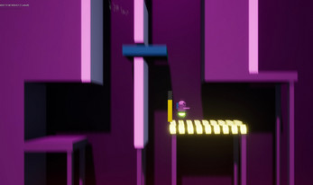
as he passes bright neon lights
he traverses a city at sleep
dashing through the sky
a silhouette can be seen
they call him the midnight runner
his mission?
only one would know...
| Status | In development |
| Platforms | Windows |
| Rating | Rated 5.0 out of 5 stars (1 total ratings) |
| Author | Breda University of Applied Sciences |
| Genre | Platformer |
Download
Download
robopill-build1.0.1 268 MB
Development log
- V1.0.1Apr 15, 2021
- (ノಠ益ಠ)ノ彡 [V 1.0]Apr 09, 2021
- V0.8Mar 26, 2021
- V 0.7.1Mar 19, 2021
- V 0.7Mar 19, 2021
- V 0.6Mar 12, 2021
- The real final build V 0.5.1Jan 28, 2021
- Final build :)Jan 28, 2021
Comments
Log in with itch.io to leave a comment.
Show post...
GOOD GAME DEVs
Hey Team ROBO PILL!
Thanks for a really solid playing build, had alot of fun with this overall so that a bonus! Yes, there's a few quality of life issues but that's to be expected!
From a Level Design perspective there's a clear adherence to the projects metrics and there's a consistency feel throughout that is commendable as that part of the hardest parts of the process, getting that consistency between levels. I can feel and see and play this where I can pick it up and run with it!. So good job here!
Block-out language is clear and accessible, I dont think I had any issues quickly reading the scene as to what I need to do.
You've managed to find a decent balance for the 3C's and effort has gone into examples demonstrated that connects to the rhythm aspect to a platformers DNA. It wants me to play more crazy levels!! Its feeling like its scratching the surface for a more exhilarating ride!
What I like going on here from a design POV is the way you use traversal wall kicks to connect the main concept of the puzzle, which I think is a smart move. This leads me into think how can you find more challenging ways of actually exiting a scene but threading back into the mix a wall kick setup to the end of a level.
Would love to see one of those horizontal green elevators forcing the player over a large pit of spikes and using the jetpack they just manage to hit the bottom of a wall kick, that with enough balanced energy, have enough to double kick towards the exit.
Default game camera has moments of 'that's the right feel!' in certain levels and I think it would be smart to focus on the cameras to find a tighter alignment. You aren't that far off, maybe two people sit down and go over the main setup and then copy the metrics over.
Ok, the gripes with the build!
Remove all editor functions being rendered to screen.
Remove the debug button to skip the start countdown as this countdown MUST be reset on every death. You have a timer that's critical to the players performance so you must reset this system in context to the player 'restarting a level after death'.
Crumbling Platforms (VFX) aren't clearing up on player respawning. Only logic I could see but double check all logic and make sure EVERYTHING resets.
PLEASE have an audio pass for next build! You can address the Menu Screen since there's alot of effort gone into the feel. Also find a more juicier feel to the main Jetpack functionality as that will really help, also find something for the player death.
No Music? So quiet,...
Maybe investigate the UI - see if there's any quality of life issues you might be able to
Final thoughts,
Find an order and redistribute the levels into a narrative that supports the projects vision. If you can try and produce a level that really plays with the green horizontal jetpack jumps as a good succession of those in a well scripted sequence would def something that I would love to see demonstrated.
In general, this feels like it's moving in the right direction, but there's a few little bits of style over substance still creeping in with your fancy camera movements and stuff. Some of this (like the countdown) really add to the feel, some of it (like the roaming camera, and arguably the fancy menu system) doesn't really make a big difference. Given that there's not a lot of final levels appearing in the build, it feels like priorities are out of alignment.
There's definitely a lot of complicated metrics to deal with here, because there's definitely issues with platform spacing based on whether the player is jumping or rocket boosting. You're going to have to consider each option in a lot of different cases.
Pay close attention to the distance the player has in which to land, because there's a lot of "skid" coming out of boosts.
Overall, there's a few hints here and there that you're developing a fun concept, but the work that I'm seeing is inconsistent, doesn't pull together, and continues (despite feedback about this) to focus on superficial developments. Sure, fancy lights and a new player mesh will add to the experience, but where IS the experience?
You really need to focus on prioritising the LD experience. Get everything in line, get your pipeline going, and start building the core experience rather than playing with the niceties.
Level 1:
Opening seems a bit dull, try and get something challenging in there
Watch out for style over substance here as well. Some nice stuff, but focus on the gameplay right now.
Level 2:
Yellow pad might need a little extra feedback.
Timer isn't resetting on completion of a level.
Watch for ceiling hazards - the hazard on the ceiling at the end of 2-2 is really hard to see.
Level 3:
Fancy glowy lights are nice, but aesthetics should be kept in line throughout project!
Timer doesn't seem to be active
3-2 loops back on itself on completion
Level 4:
Metrics are really off here. Consider how much space the player needs when moving to recharge their boost. It isn't fun to just sit around and wait, especially when there's a timer ticking down.
4-2, hazards need to be timed precisely AND that timing needs to reset when the player dies! Couldn't actually pass this bit. Give me some breathing room between challenges!
Would be within the projects best interest to give this landing page a lick of paint. Really not feeling the pull to DL this game based on this page.
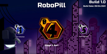
Love the menu system carousel, interested in seeing further iterations of this moving forward.
You have a rather nice aesthetic within the design site, quite surprised to not see the same attention to detail in the actual build. There's a real lack of character that is sorely missed to help build a stronger appeal.
Be mindful of surface types that are designed to impact the players progression. Due to the nature of constructing the scene from the ground up the elements added to the scene that are a form of hazard need to be aligned more tightly to a platform. Currently the player can circumnavigate the threat and recharge the jetpack by mantling on edges of platforms.
Fix platform mantling, right now the capsule collision presents readability issues that feels more like the 3C's model abuses 'pixel perfect jumping' throughout.
Camera!!! Please figure out what this project needs. I've played a few levels to find that the camera isnt not helping reveal the setup. Be very mindful of that and how fast the player flies versus how much they can see. As a player I failed to complete setups due to bad placement. You need to help the player more. Sebastian's level had the smartest camera for what he's investigating.
Consistency!! At this early stage its clear that metrics need to be shared, best practices of setup need to be explored.
2nd jump to jetpack of a wall kick. This, for what ever reason, is not intuitive or completing every time I've tried. Make sure the player is well verse with the mechanic prior to sticking something under them to kill them, please.
GYM exploration. Please use this to experiment with more gameplay scenarios. Maybe lets not get too fixated on 'time taken to complete'. Lets start to investigate what's the core building blocks of what this game is all about.
Final thoughts, yeah, alot more investigations on what makes RoboPill 'pop'. Right now Im seeing process but very rarely excited about the challenge. There's more scope to make full use of that jetpack which as a designer feels woefully under serve on this project. At this stage in development you need to really spark a bit more investment into working out what is fun about this game and build around that,