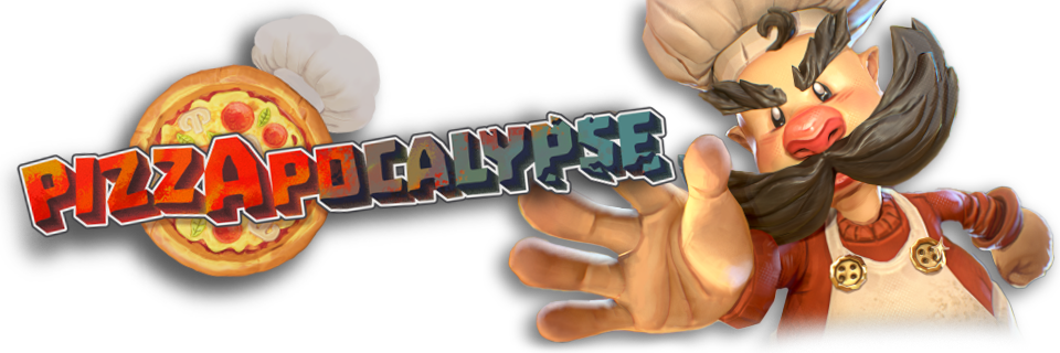
Pizzapocalypse
A downloadable game for Windows
Wishlist Pizzapocalypse 2!

Pizzapocalypse 1 on Steam!

Save the world with pizza!
As a pizza chef, master your pizza to traverse a corporation-ridden city and make a delivery to those in need in this cartoony 3D platformer!
It feels like the world has forgotten about the joys of authentic, handmade pizza, but one pizza chef is determined to deliver rich, traditional Italian cuisine in spite of the oppressive Pizza Corps.
Pizzapocalypse is a short game made in twelve weeks by second-year university students.
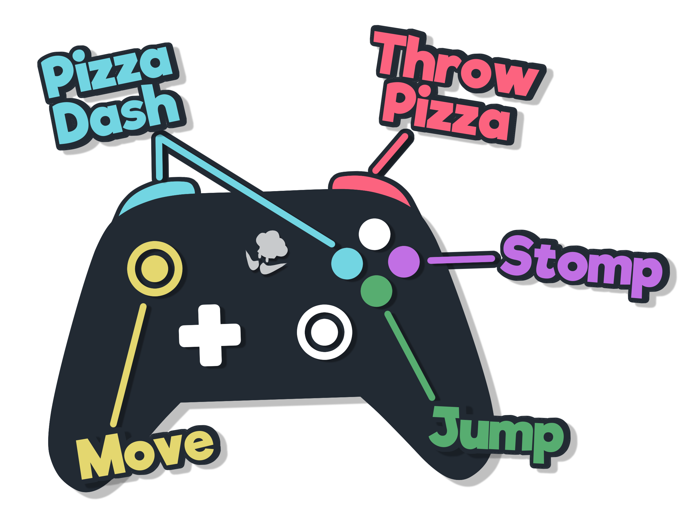
Controls

Credits
(Team Funny Rock Image)
Designers & Programmers
| Genna Khudilaynen | Producer, Creative Lead |
| Vittorio Bellinello | Design Lead, 3Cs Design, SFX, Music |
| Daan Eijkhout | 3Cs Design |
| Bas Willem Kars | 3Cs & Technical Design |
| Robbin Verwijs | User Interface |
| Joël John | Gameplay & Automated Build Program |
| Martijn Tielemans | Enemy Design, Generalist |
| Santiago de Aranda | Enemy Design, Concept & Graphic Art |
| Ruben van Gijsel | Enemy Design, Main Menu Environment |
| Jael Chan | Level Design |
| Toby Canham | Level Design |
Visual Artists
| Sin Brennan | Art Lead, Environment & Lighting Art |
| Lars Rongen | Environment Art, Art Co-lead |
| Irene Houward | Tech, Environment & VFX Art |
| Teodora Hushtinarova | Procedural Generation & Optimization |
| Victoria Kim | Concepting & Character Art |
| Elif Özdemir | Character Art, Texture Art |
| Dania Karli | Character Animation, Rigging |
Trailer Music
Download
Install instructions
- Download the game, then right click on the .zip, and extract the contents.
- Then, run Pizzapocalypse.exe to play the game.
- If you get a warning, click "more info", and then "run anyway" to proceed!
Development log
- Pizzapocalypse 2 REVEAL!Nov 29, 2025
- 1.2.7 - Thank you! + (The Cleanup)Oct 21, 2024
- 1.2 - Steam Release!Oct 09, 2024
- 1.1 - Moving PartsJul 01, 2024
- 1.0 - PizzapocalypseJun 24, 2024
- 0.5 - The "Grime & Shine" UpdateJun 22, 2024
- 0.4 - The "Made with Love" UpdateJun 20, 2024
- 0.3 - The "Glow-up"...dateJun 19, 2024


Comments
Log in with itch.io to leave a comment.
It's like A Hat in Time, but pizza. I rank this game 11 Capricciosas of 10 Margheritas.
Super Mario Odyssey Bootleg.
Cooles Game:
I like this art style, it’s cozy. And gameplay is relaxing
Nice game 👍
the movement is smooth!
best,
ghoul loc
https://ghoullocalization.blog/
reminds me of pizza tower witch is one of my favorite games nice cover ar
fun game, enjoyed getting above the map :D. the movement is krazy fun
wow graet game but short we need more level pls
wOW this game is incredible 🍕🧡 the gameplay is solid, the movement is responsive, the enemies are so much fun, animations are fantastic, the level design is so inventive that it feels fun to just run around and discover hard-to-reach spots, even the pause menu feels great. The whole game is just incredibly polished and the art is so beautiful too!!! I love the credits song too hahah
congrats on the awards as well guys, absolutely deserved 👏👏
Thank you so much Aedan! 🍕💖
I played this during industry day and immediately fell in love with it! 🍕
A very fun, quirky fantasy of delivering pizza combined with smooth 3Cs and clever level design had me collecting ingredients, stopping enemies and wa-hooing my way to the finish line!
I love how you took inspiration from Super Mario Odyssey's moveset and allow the player to string together cool moves in clever ways like jumping off your pizza as an extra platform.
Great job, y'all! (P.S. Pineapple belongs on pizza! 🍍)
Enjoyed movement of the game, simple and smooth. The game has a nice vibe to it, the town art style and the big moustache. mamma mia/10
Really fun experience and great artstyle
Thank you! It was fun watching you experience our game😁
Great game, great concept. I'm a big pizza fan myself 10/10
We're glad you enjoyed, we're all pizza fans outselves! Thank you so much for the footage!
I really enjoyed the old Italian townscape, the style in which the story is told in fragments on posters, and the action elements that make use of pizza as much as possible!
The map structure is quite high and low, and I could tell it was carefully crafted.
I especially like the place where you can see the back of the stage quite far from the top of a long bridge.
Also, the song in the credits was a lot of fun to listen to, meow~!
Thanks for trying out our game! It was a lot of fun watching you play, and we're glad you enjoyed it! Meow~
Loved playing this game! Movements feel very satisfying and it's so fun experimenting with the different moves you can do. I also feel like all the decorations like windows, plants etc make the world feel nice and alive but not too crowded. Super fun and visually appealing platformer!
One fun addition I could think of for future updates might be timer based ingredients you could grab. This would be fun to really try and master the controls/moves. This can add more expert elements while still keeping the game beginner friendly since they are optional.
Overall, great game!!
We're so happy to read your kind comment! We can definitely consider that if we continue adding features in the future!
Pizzapocalypse🍕Gameplay
Oh thanks for sharing your gameplay 🙏
The movement and the overall gameplay feel is great but I feel the enemies and map design are lacking, I also would love to see DirectInput support for playstation controllers, I think the unshielded default enemy needs to go as they're not even remotely a threat, just the shield ones are good though.
We appreciate the feedback! We'll take a look into implementing playstation controller support!
Loved how the game and the movement feels. The level design is great and I enjoyed trying to get out of bounds. 9/10 would go out of bounds again
We just can't contain your unmatched pizza skills.
So that's the pizza chef who's been destroying my property and stealing my customers with his "authentic" pizza. He's a criminal and deserves what he gets. 10/10 game, I like seeing him get stomped.
Loved trying this game out! It was really fun getting used to the controls and exploring the environment, the visuals look great. Control-wise, the game felt very smooth, and I like how the camera changes position as you move around the map. Also huge props to the music and audio, I'm a big fan of it!
Thank you so much for the lovely comment! We're happy you liked so many elements of the game!
Thank you for playing Gab!
i literally didnt even install the game i was like "YOO THIS IS FREAKING SICK"
Glad you think so! We hope you'll enjoy the game just as much when you play it :D
This game is great!!! I played it both while trying to collect every possible collectible, and I tried to speedrun it, and both ways to play are so much fun~ An online leaderboard would be a great addition, I think :D
We're really happy you enjoyed it so much! We'll consider a leaderboard :)
Pros:
- The Concept is good, movement is obviously a bit clunky but not terrible, my controller failed to connect so i had to play on keyboard.
- Movement tech it's good and responsive, i wasn't bad, compared to to other games i say it's pretty alright, but the movement combos are few.
- The level Design is fairly good the branching with different paths is nice and you have different choices, and there are also secrets and i found them.
Cons:- Camera work is a bit shabby, i understand that i might have been made like this to compensate for level design and probably to save on resources and map decals, didn't really like it but i wasn't terrible, i got used to it, if the transition between different angles was faster i would have liked it more.
- For a game called pizza apocalypse, The streets seem really clean, i don't see the Apocalypse.
- Some bugs but that are not game breaking, enemies can hit you and send you under the map, but pressing R fixed everything.
- I have a pretty decent computer i managed to get 60 frames on everything only by setting everything on low, it's not that well optimized.
As a demo game, it was pretty good, i would lie if i said that i didn't enjoy the demo.Thanks for all the feedback! You make some really good points. We'll be sure to address as many as we can by the full release.
The most pressing issues like enemies pushing you underground should be fixed in the next public build coming soon! :)
fun game, enjoyed getting above the map :D. the movement is krazy fun
I agree! The blue pilled level designers don't want us to get out don't let them stop us
Congrats on breaking out! Despite our efforts, we couldn't hold you back! Glad you had fun with the movement 😁
Oh shit I didn't know you can do that
The level designers have won, as a part of the development team I can no longer find a way out of the map sadly ;-; though lemme know if it possible so we can triumph over the level designers :3
damn so it got fixed
dffd
Just know that within the development team this message has become a legend 🙏
I feel like the game is very charming, the models are cute and the movement feels really good to learn, definitely something that has a lot of potential, some of the things that can be improved would mostly have to do with the main menu, for example adding sounds when you are clicking on stuff would make the menu feel more lively, it would also help you see how quiet/loud the game is when you are playing with the audio settings, lastly, you could add a page for the keybinds in the game itself, although i believe the game does a good job of introducing you to the controls, it stands to benefit from having an easily accessible list, honestly in the few minutes i played
We appreciate the comment! We agree, and will be adding menu sounds soon enough.
An accessible controls list is a great idea. We'll see if we have time to implement it soon.
Thank you!
Can you make it so that it can be played in the browser, I understand if you can't, but this game looks really good and I am not allowed to download it on my school laptop. I REALLY WANNA PLAY THIS GAME!!!!
Thanks for stopping by! We're sorry to say, that's not possible at the moment. We hope you get the chance to download and try the game some other time!
Amazing job, such a fun and charming game you have here! I really love seeing student projects with this much personality.
I took some notes, since it's an early access, do you want me to share my feedback with you guys?
Thank you so much for the kind words!
We'd be more than happy to receive the feedback and use it to better the game in time for its full release!
Good to hear! Of course this are just personal opinions, I'm no expert and I understand you have limited time, so do whatever you want with them :).
Disclaimer: I just saw that you updated the game, I played a previous version so some things I mention here may not be relevant anymore.
The platforming is quite dynamic and has a unique feel to it. The level is very interesting to play, it allows for a good amount of freedom, the different paths to reach the same goal made me replay the level (doesn't happen often). I loved seeing how there has been a lot of effort put into the level design, it really paid off. It also has a very nice length for this kind of project.
Good onboarding is something many of these kinds of projects lack, yours is not too bad but it's still nowhere near perfect. I can easily overcome the challenge with other moves that are not the intended ones, and just having the controller at the very beggining wasn't too helpful. The drawings on the wall are such a nice addition though (although I think some guide that tells you the separate steps of the action and its respective input would really help).
Even if I feel like some of the enemies don't add much, they contribute to make the game feel more interesting and fleshed out. I do have one issue with the basic(?) one: its behaviour just feels kind of awkward (one persistent thing I noticed is that when they hit you they go back to its default position and then get alerted again?, also they feel way too big for me to stomp on them, even if I actually can) which feels very weird considering how polished the rest of the AI is. I like the shielded variation since the regular ones barely have a chance to do anything because they're very easily killable. The platform and the vacuum ones are very fun, but the vacuum one barely gives the player any chance to interact with it, it's so fast and aggressive.
I really don't like the ragdoll when you get hit, it gives a very cheap look... it really feels completely out of place in this game. Also, you should add some invincibility time, since you can get hit by the smoke multiple times and again breaks the polished look.
The art look amazing!! I'm really looking forward to the final release. Love the colors, the textures and the overall feel, good job on that. The level is looking amazing, its impressive how good the buildings turned out (although I'm not a fan of the inside of the windows), and it's a big achievement that you were able to make a visually interesting level just with buildings and rooftops, especially with a level as big as this one. I particularly like how the enemies look and move, and how they contrast the rest of the elements while still fitting the style, loved their designs.
I would love to see more of the buildings with rounded corners like at the beggining, it really makes a difference. Also please try to get the aqueduct done if you have the time, it shouldn't be too complicated to make and it would be such a nice addition!!
The shader that hides buildings really needs a lot of work, I assume you are already aware of it, but as it is right now, it gives such an amateur feeling to the game, when most of the game doesn't. Not only because of how it interfere with buildings that are not blocking the view (which I think should be easy to solve), but mainly because the way the space "inside" the buildings is handled now doesn't work or look good, try to look up references for that!
Again, regarding shaders, it's so sad to see the water as it is right now surrounded by very polished and nicely textured stuff, but I assume it's a placeholder as it is now?
Some of the VFX are very good and well integrated, but others are lacking, specially the enemy alert one (its too big, doesn't fit too well, and the shape itself looks amateur) and the enemy's shield (it's too shiny, takes up so much space (why does it need two rings?), and doesn't fit in with the rest of the game either). Also the smoke one, it's not bad but some polishing could be nice.
All the UI looks so professional and slick, really. I was so impressed by the end screen, it is so satisfying, I loved it (the extra challenges that the game offers are a very cool addition too). The settings menu is also on another level for the standart for this kind of game, good job. The main menu as it is right now feels quite empty, but I assume the background is a placeholder.
I do have to say, it's such a shame that the game looks this good in-game, and then some of the 2D assets don't keep up with it (it's usually the opposite). I'm mainly talking about the logo, I wouldn't have a problem with it if the overall quality of the art wasn't so high, but it is, and that is not reflected in the logo at all, it looks like it's importance has been underestimated. I share this feeling with the pizza in the menus, the banner and the controller, although definitely not as strongly. I think that, if you have the time, it's worth investing some more time on a good logo, it is one of the first things that will be seen from your game, and it can make such a big difference.
That was all, hope at least something was helpful. I'm very excited to see the final release. You should be very proud of your work, good job guys!
Thank you so much for taking the time to write up such extensive feedback. It's all very well thought out and explained. We're hoping to address most of this by the full release! We really appreciate the kind words!